You know that feeling. You walk into a hotel room, drop your bags, and just… stop. Something about it makes you exhale. It’s calm. It’s beautiful. The bed looks like it was styled by someone who actually cared. The lighting is soft and warm. Nothing is cluttered, nothing is mismatched, and somehow the whole room feels like it belongs together — like it was always meant to look exactly like this.
Then you go home and look at your own bedroom, and you can’t quite put your finger on why it doesn’t feel the same way.
Here’s what I’ve learned after years of styling rooms on realistic budgets: it’s almost never about expensive furniture. The hotels you love aren’t luxurious because they spent a fortune — they’re luxurious because they follow 7 specific principles that most people have never thought about. And every single one of them is something you can do this week, without a renovation or a designer.
This is your guide to a luxury bedroom on a budget — the kind of bedroom decor tips that actually work in real homes. And if you haven’t yet worked out the overall look you’re going for, start with how to find your home decor aesthetic — it’ll make everything in this post click faster.
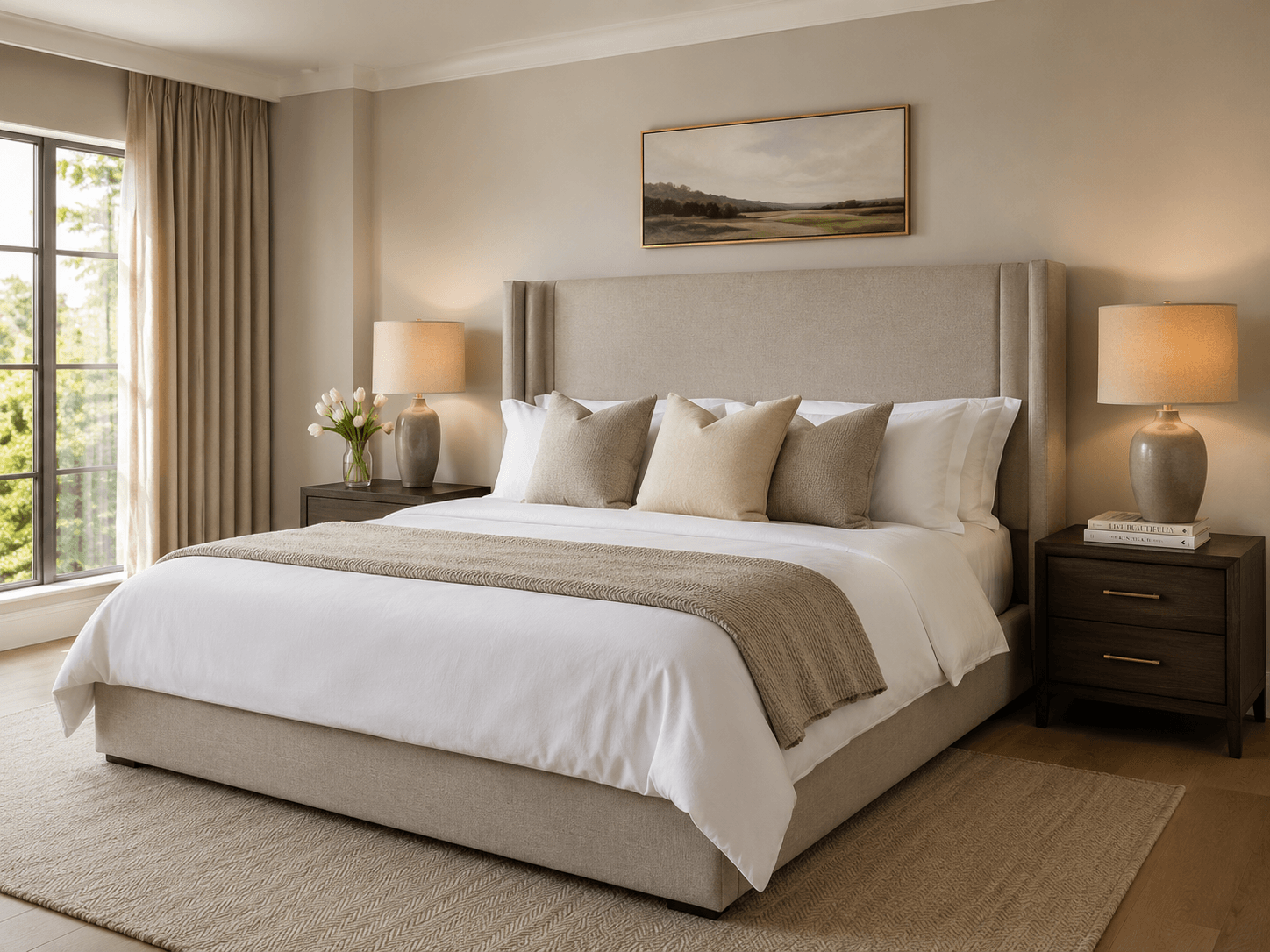
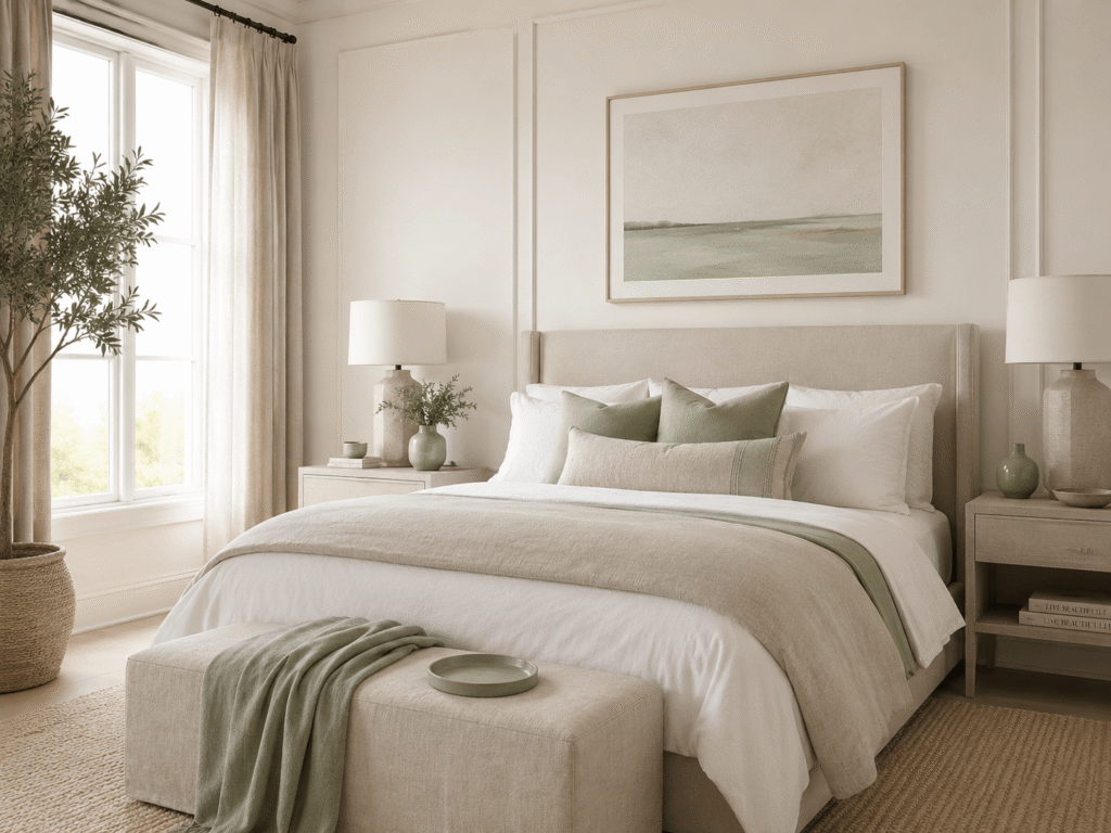
Tip 1 — Invest in Bed Linen Before Anything Else

If you take nothing else from this post, take this: your bedding is the single most impactful thing in the room. It takes up more visual space than your furniture, your art, or your curtains combined. And yet most of us are sleeping on sheets that are years old, slightly bobbled, or a pattern that made sense in a different flat.
The first time I replaced my mismatched duvet set with a proper white cotton percale set, I genuinely stood in the doorway for a moment. The room looked completely different — not because anything else had changed, but because the bed had.
What actually makes bed linen look expensive:
Thread count matters — but only up to a point. Anything between 200 and 400 thread count in 100% cotton is the sweet spot. Above 400, manufacturers start weaving shorter fibres to inflate the number and the fabric actually feels worse over time — Which? tested this and found thread count is mostly a marketing myth. What you want is cotton percale (crisp, cool, hotel-classic) or cotton sateen (slightly silky, draped).
White and neutral reads as luxury. This is one of those bedroom decor tips that stylists know but rarely explain: white linen signals intentionality. It says the room was considered. Warm whites, soft creams, and stone tones all work. You can add colour through cushions and throws — but keep the main linen neutral.
Iron or steam your pillowcases — and your duvet cover. This takes under ten minutes and makes a disproportionate difference. Run a steamer over the duvet cover while it’s on the bed, pulling it smooth as you go. Crisp, flat linen is the single biggest visual gap between a hotel bed and a home bed.
What most people get wrong: Buying expensive bedding and then not pressing it. An ironed £30 duvet set will always look better than a crumpled £150 one. The pressing is the point.
🇬🇧 UK note: In UK homes, particularly flats with smaller windows, white linen bounces light beautifully and helps rooms feel brighter and more open. This trick works especially well here.
Tip 2 — The Rule of Odd Numbers in Bedroom Styling
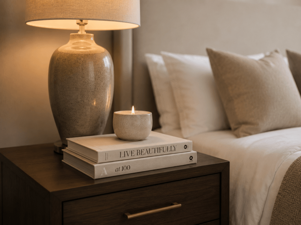
Interior stylists use odd numbers everywhere, and once you know about it, you’ll see it in every room you admire. Three cushions instead of two. One bedside lamp with two books and a candle. Five stems in a vase instead of four.
Why does it work? Even numbers feel static and expected — the eye settles. Odd numbers create slight visual tension, which is what makes a vignette feel “styled” rather than just “placed.”
When I finally stopped buying matching pairs of everything and started grouping in threes, the room started to look like someone had actually thought about it. Which, of course, I had — but it had never looked that way before.
Try this on your bedside table: one lamp (tall), one small stack of books (medium), one object — a candle, a small plant, or a stone (low). That three-level grouping at different heights is exactly what you see in every beautifully styled bedroom photograph.
What most people get wrong: Buying two of everything because it feels “balanced.” Matching pairs read as functional, not styled. One lamp is always more interesting than two identical ones.
Tip 3 — Clear the Floor Completely
Nothing kills the feeling of a luxury bedroom faster than things on the floor. Not dirty things — things in general. A gym bag by the wardrobe. A pair of shoes kicked off by the bed. A chair used as a holding station for clothes that aren’t quite clean but aren’t quite dirty either.
Floor clutter is the biggest luxury killer in most bedrooms, and it works subconsciously — your brain reads “stuff on the floor” as “not a place of rest.” Hotels are exceptional at this not because they have more storage, but because there is a place for everything and everything is in it.
When I finally dealt with my floor-level chaos — and I mean dealt with it properly, not just kicked it into the wardrobe — the bedroom felt like it had doubled in size. Nothing else changed. The floor was just clear.
What to do this week: spend 20 minutes identifying everything that lives on your floor. Shoes need a rack or a box. Clothes need a hook, a laundry basket, or a chair that is actually designated for the purpose — not a holding chair, a real chair with intention. A woven basket at the end of the bed is a stylish way to corral throws, gym gear, or anything in transition. Once the floor is clear, keep it clear. This is a discipline, not a one-time tidy.
A note on storage that also looks good: Under-bed storage boxes in a neutral fabric, a slim shoe cabinet that doubles as a surface, a rattan laundry basket instead of a plastic bin. The storage you choose should look like it belongs in the room, not like it’s hiding from it.
What most people get wrong: Tidying the surfaces and ignoring the floor. Surfaces read as “styled.” Floors read as “lived in” — and not in a good way.
🇬🇧 UK note: In smaller UK bedrooms and flats, clear floors make a dramatic difference to perceived space. This tip has more impact here than almost anywhere else.
Tip 4 — Lighting Changes Everything
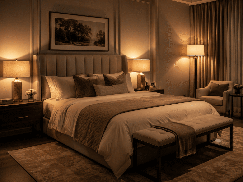
Overhead lighting in a bedroom is almost always a mistake — and in most UK flats and older homes, it’s a single ceiling bulb that casts a harsh, flat light that makes everything look slightly grim.
The rooms you love in hotels and magazines are never lit from above. They use layers: bedside lamps, floor lamps, and sometimes wall sconces, all using warm bulbs (2700–3000K on the colour temperature scale, which you’ll find on the bulb packaging). That warm glow is what makes a room feel intimate and expensive.
You don’t need to rewire anything. Plug-in bedside lamps are inexpensive and widely available. A floor lamp in the corner creates immediate depth. Even swapping a cool white bulb overhead for a warm one (same fitting, different bulb) costs under £5 and changes the entire mood of the room.
My own bedroom lighting transformation happened in an evening. I bought two small plug-in lamps for the bedside tables, turned off the overhead light, and the room immediately felt like somewhere I actually wanted to be.
Rule of thumb: you should be able to read comfortably by your bedside light, but overhead lighting should never be on in the evening. Layer, always.
What most people get wrong: Buying a beautiful lamp and pairing it with a cool daylight bulb. Always check the bulb. Warm white, 2700K. Every time.
🇬🇧 UK note: Warmer lighting is especially important in UK homes, where natural light is lower for much of the year. This isn’t optional — it’s the difference between a bedroom that feels cosy and one that feels clinical.
Tip 5 — Use Height
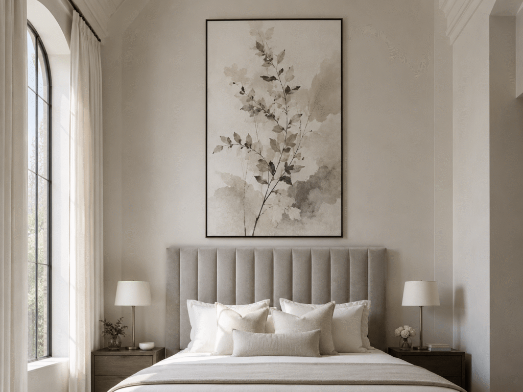
Most bedroom styling happens horizontally — things are placed across surfaces — and that’s exactly why most bedrooms feel average. The secret to a room that feels spacious and considered is drawing the eye upward.
The single most effective way to do this is with a tall headboard or a large piece of art above the bed. When your eye is pulled up, the ceiling feels higher. The room feels larger. The bed becomes the anchor it’s supposed to be.
If you can’t change your headboard, hang art. Not small art — large art, or a grouping of frames that together form a substantial shape. A single A1-sized print above a double bed, framed simply in black or natural wood, creates height and intention. A gallery wall that extends from behind the pillow line up toward the ceiling does the same.
The wall above your bed is prime real estate. If it’s bare, the room will always feel unfinished. If it’s considered, the entire room lifts.
What most people get wrong: Hanging art at eye-level when standing, which is too low above a bed. Art above a bed should sit roughly 15–20cm above the top of the headboard, or start where the headboard ends and extend upward. Let it be tall.
🇬🇧 UK note: In UK flats with lower ceilings — common in Victorian and purpose-built conversions — this trick is even more valuable. Vertical art or a tall headboard works against the ceiling and creates the illusion of height. Avoid low, horizontal art — it emphasises the ceiling’s limitations in the wrong direction.
Tip 6 — Colour Discipline — Choose 3 and Stick to Them
A room that looks expensive is almost always a room that is edited. Not sparse, not cold — edited. And that means colour discipline.
Choose three colours for your bedroom and use only those three throughout. Not three colours plus several neutrals — three, full stop (white walls and natural wood don’t count as “colours” for this purpose). For example:
- Warm white walls, soft sage green, and natural linen
- Dusty blush, warm grey, and off-white
- Navy, brass, and cream
Not sure which colour direction feels right for you? My guide on finding your home decor aesthetic has a simple three-word exercise that makes this decision much easier.
When you choose three and stick to them, something aligns in the room. The cushions talk to the throw, which talks to the lampshade, which echoes the art. That coherence is what your brain reads as “expensive” — not price, but intention.
The chaos that makes most bedrooms feel busy and low-end isn’t furniture — it’s five different colours on the soft furnishings that were never meant to exist in the same room.
Go through your bedroom now and count the colours. If you can count more than four (excluding neutrals), you’ve found something to work on.
What most people get wrong: Buying cushions and throws they love individually, without checking if they belong together. Hold them all up at once in natural light before buying. If they don’t all speak to each other, one of them needs to go back.
Tip 7 — Fresh Flowers or a Single Quality Plant
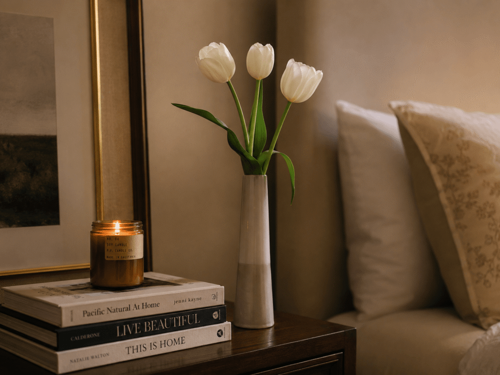
This is the tip that surprises people the most, and it’s also the one that costs the least.
A single vase of fresh flowers or one considered houseplant adds something to a bedroom that nothing else can replicate: life. It’s the reason hotel rooms feel cared for even when you know no one has thought about them. It’s the reason beautifully styled bedroom photographs always seem to have a sprig of eucalyptus or a small potted plant on the bedside table.
You don’t need an elaborate arrangement. Three white tulips in a thin-necked vase. A stem or two of dried pampas in a clay pot. A small potted trailing ivy on the windowsill. One quality thing — chosen, placed, tended.
When I started keeping a small vase of seasonal flowers on my bedside table — whatever was affordable at the supermarket that week, nothing fancy — the room started to feel like somewhere someone actually lived and cared about. That’s the feeling we’re after.
If fresh flowers aren’t practical (pets, allergies, forgetfulness), a single quality plant works just as well. Good low-maintenance options: a small rubber plant, a pothos trailing from a shelf, or a ZZ plant on the dresser — its glossy leaves catch light the way a healthy, considered room should. One. In a nice pot. In a considered spot.
What most people get wrong: Either buying too many plants (which reads as clutter) or choosing a plant and leaving it in its plastic nursery pot. Repot into something ceramic, terracotta, or woven. The pot is part of the styling.
Start With One or Two This Week
You don’t need to do all seven at once. In fact, please don’t — the pressure of a whole-room overhaul is exactly why most of us never start.
Pick the tip that resonates most right now. Maybe it’s swapping your bed linen for something neutral and properly pressed. Maybe it’s clearing your floor and feeling what that does to the room. Maybe it’s buying a plug-in lamp and turning off the overhead light for an evening.
One change, done well, will show you that this works. And then you’ll want to do the next one.
A bedroom that feels like a boutique hotel isn’t about money. It’s about the same seven things, applied with a little patience and a genuine eye for what makes a room feel like rest. You can build that — in your flat, in your budget, this week.
Not sure where to start? Read how to find your home decor aesthetic first — it’ll make every decision in this post land faster.